A screen that looks navigable is not necessarily usable with a screen reader. VoiceOver on iPhone and TalkBack on Android announce controls, explain their states and move focus through an interface. If a deposit-help link is announced only as “button,” an error appears silently or a modal cannot be exited, the user may be unable to complete even a harmless task without sighted assistance.
This guide describes how to test gambling app screen reader accessibility using repeatable, low-risk tasks. It focuses on spoken labels, reading order, accessible control states, dialogs and announcements. Text enlargement is covered in the separate Dynamic Type versus Android font scaling guide; contrast and color themes have their own dark-mode audit. The examples here are expected behaviors and test prompts, not findings from specific operators.
What screen reader compatibility actually means
A screen reader needs more than text on a screen. Interactive elements should expose a meaningful name, their role and their current state. Focus must move in a useful order. Changes such as validation errors or session-expiry notices should be perceivable without requiring the user to hunt through the whole page.
| Element | What to hear | Failure worth recording |
|---|---|---|
| Navigation tab | Clear destination, selection state | “Tab 3” with no meaningful name |
| Search or help field | Purpose and input state | Unlabeled text field |
| Toggle | Label and on/off state | Change occurs silently |
| Dialog | Its purpose and accessible actions | Focus moves behind the dialog |
| Inline error | Problem and a route to correction | Visual red text is not announced |
| Loading or success state | Appropriate status change | Endless “loading” with no resolution |
Apple’s VoiceOver evaluation criteria emphasize concise, unambiguous labels and logical navigation. Android’s TalkBack testing guide recommends exploring each element in sequence and checking whether temporary messages are spoken. These are platform design expectations; they are not evidence that any particular gambling app complies.
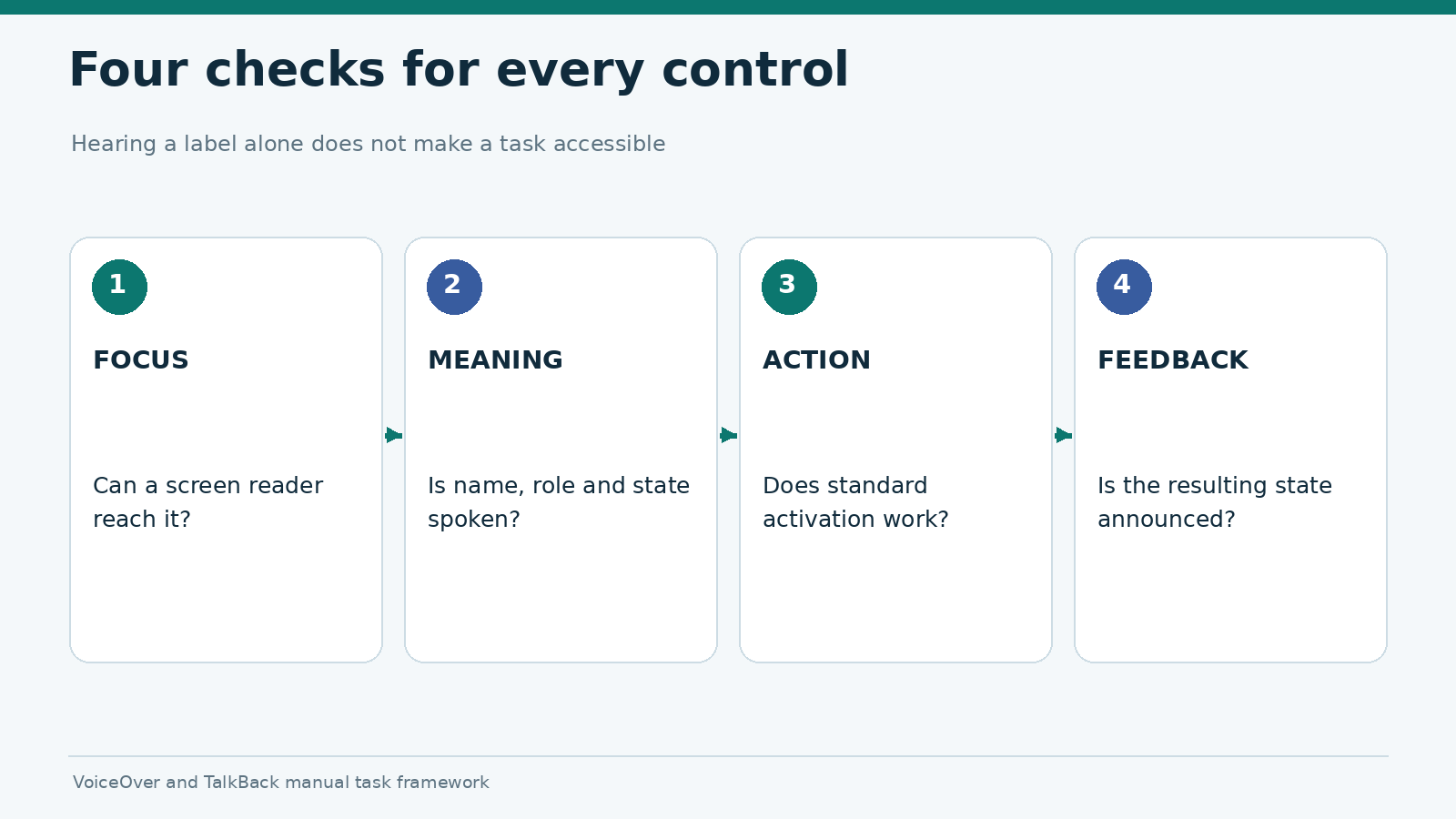
A screen reader audit should also distinguish could be focused, could be understood and could be activated. A control that speaks correctly but cannot be triggered is not accessible merely because the label exists.
Set up VoiceOver and TalkBack for comparable tests
Use real devices wherever possible. On an iPhone, VoiceOver is available under Settings > Accessibility > VoiceOver. On Android, TalkBack is typically under Settings > Accessibility > TalkBack, although the exact menu and feature availability can vary by device and software build. Review the screen reader’s tutorial before testing so an unfamiliar gesture is not reported as a product defect.
Record the screen reader version when available, device model, OS build, app build, interface language and whether the app is native or browser-based. Test in the same language and with the same account state on both platforms. Use headphones where spoken feedback might reveal private information to bystanders.
For a first pass, navigate only with the screen reader’s usual next/previous focus gestures and activate the focused item. Then explore by touch to find controls that the linear sequence may have skipped. If an important element exists visually but cannot be reached through either route, capture the exact navigation sequence.
Five safe tasks for the initial pass
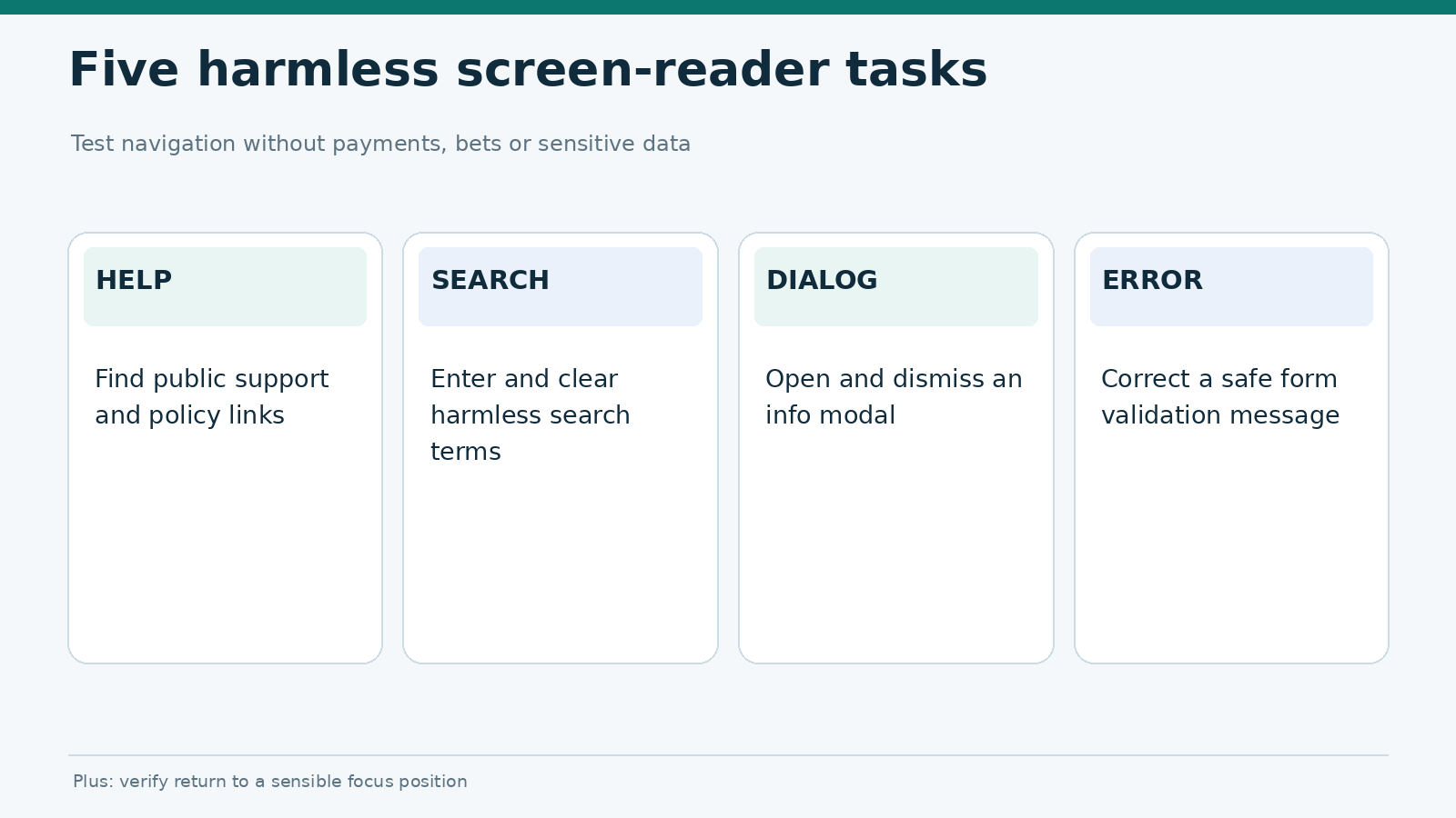
- Open a public help or responsible-gambling information page from the main navigation.
- Locate and read a privacy or permissions explanation without signing in.
- Use a harmless search field or filter, then clear it.
- Open and dismiss a non-financial informational dialog.
- Trigger a benign form validation error in a test or public form, then correct it.
Avoid placing wagers, creating deposits, sending identity documents or changing withdrawal details just to produce a screen reader finding. If an accessibility issue is limited to a sensitive workflow, it can be evaluated with approved staging data or operator-provided evidence.
Check labels, roles and control states
The label should tell a person what an element does, not merely what it looks like. “Open account settings” is more useful than “gear icon.” For repeated controls, the context matters: five “More” buttons in a list are difficult to distinguish. State also needs to be exposed. A selected tab, expanded section or disabled button should not rely on color or shape alone.
Android’s accessibility principles describe semantic properties and useful labels. Apple’s evaluation criteria similarly warn against putting a role twice into a label when the platform already announces the role. A spoken string such as “Submit button, button” may indicate redundant labeling, although the exact output depends on the control and screen reader settings.
| Audit prompt | Good evidence | Example issue wording |
|---|---|---|
| Is the name meaningful outside visual context? | Spoken output recorded | “Account icon announced as ‘Image’” |
| Is the control’s role available? | Button, link, switch, field or equivalent announced | “Clickable panel announced as static text” |
| Is selection/state clear? | Selected/expanded/checked state conveyed | “Active filter not identified” |
| Is hidden content handled? | Focus avoids visually hidden or inactive controls | “Focus lands on dismissed drawer items” |
| Can activation succeed? | Expected safe response follows standard action | “Focusable Help item cannot be activated” |
Describe the observed accessibility tree behavior rather than guessing which framework or API caused it. A tester without source-code access cannot reliably infer whether the issue comes from a missing contentDescription, a custom view implementation or a separate app-level bug.
Reading order, headings and modal focus
A useful reading sequence follows the user’s likely task: page title, context, key content, then available actions. A visually prominent heading should be recognizable as a heading where the platform supports that semantic structure. It should not take ten unrelated focus steps to reach the first meaningful control on a short page.
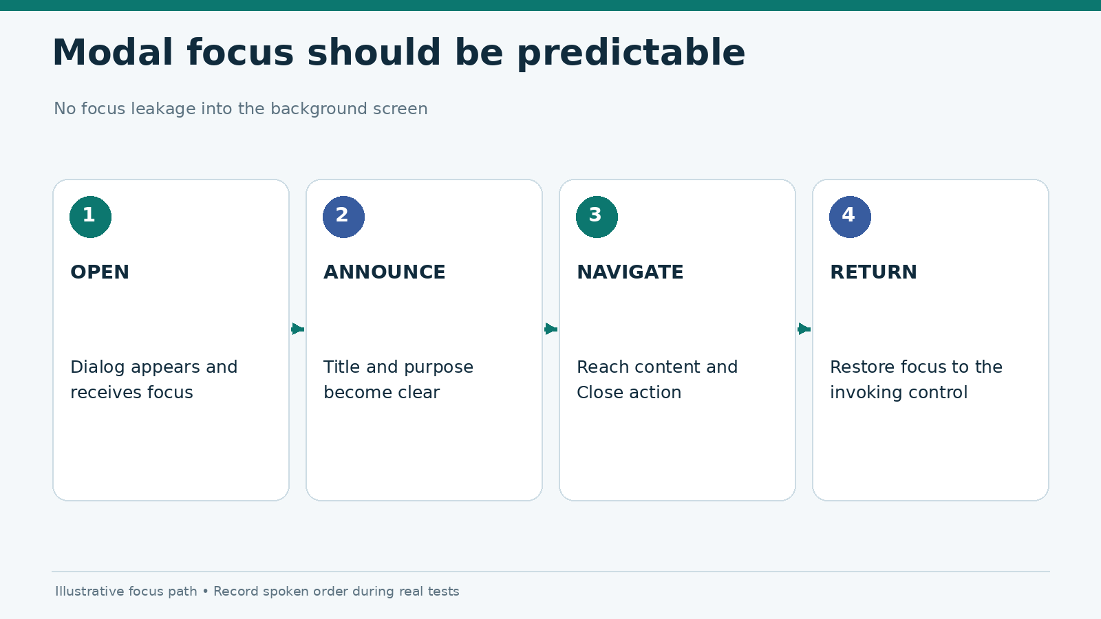
Dialogs deserve an independent test. Open an informational modal, then navigate forward and backward. Does focus stay on relevant dialog content? Can the dialog be dismissed using a discoverable button or supported system action? Does focus return to a sensible location after closing? Unexpected jumps can disorient users even when every individual label is technically correct.
Record focus order as a sequence, such as Page title → Help link → Search field → Search result → Close. If the order fails, record the exact step where focus jumps, repeats, disappears or enters obscured controls. This is stronger evidence than a screenshot alone because focus behavior unfolds over time.
Dynamic announcements: errors, loading and session changes
A common problem appears after an interaction. A user activates a control, the screen changes, but the screen reader offers no usable feedback. The visible interface may show “No results” or “Session expired” while speech remains silent. On the web, WCAG 2.2’s status messages criterion addresses programmatic exposure of certain status changes. Native apps also need appropriate accessibility announcements, although the API mechanism differs by platform.
Test three categories with harmless actions: progress (“Loading help”), result (“No matching articles”) and error (“Enter a valid search term”). Observe whether a useful announcement occurs, whether it interrupts an essential sentence and whether the user can find the message again. Repeated, unsolicited speech can be as obstructive as silence.
A gambling app may also present timeout or access restriction notices. The message should be perceivable through assistive technology and should not disclose private details unnecessarily. To assess the underlying timeout and resume decision, use the separate iOS versus Android session-resume protocol.
Rate the impact, not only the defect type
| Severity | Practical definition | Illustrative example |
|---|---|---|
| Blocker | No supported route through a necessary safe task | Help dialog traps focus with no exit |
| Major | Task can proceed only with guesswork or workarounds | Search validation error not announced |
| Moderate | Task is possible but unusually slow or confusing | Repeated context-free buttons |
| Minor | Small annoyance without loss of understanding | Redundant role announced twice |
These labels are editorial impact categories, not a certification standard. Critical account, legal and responsible-gambling information deserves particular attention because lack of accessible access can have consequences beyond inconvenience.
Evidence record and retest process
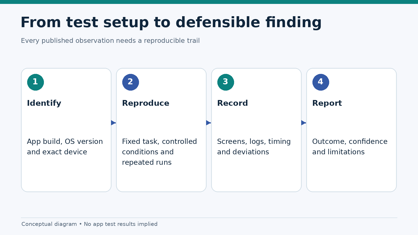
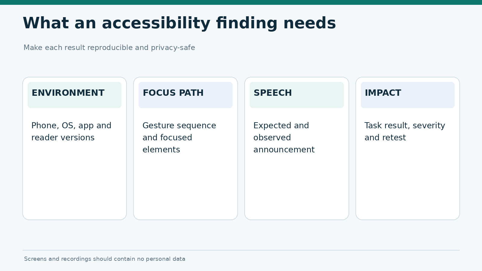
A useful screen reader finding contains the device and app versions, the task, the navigation path, the expected announcement, the actual announcement and the effect on task completion. Include a short screen recording with recorded speech output when consent and privacy settings allow. Otherwise, keep a timestamped spoken-output transcript and sequence of focus targets. Redact account identifiers, balances and personal information.
Repeat the same tasks after the relevant app version changes. Test the affected component directly first, then test neighboring navigation routes in case a fix introduces a new focus trap. Do not publish an overall “fully accessible” verdict based on five tasks. Such a claim would require broader coverage, assistive-technology combinations and, ideally, testing with people who depend on screen readers.
The related navigation audit focuses on how many touch interactions it takes to reach a destination. The screen reader audit uses different measures: findability by spoken navigation, semantic clarity and successful activation.
Frequently asked questions
Is VoiceOver the same as TalkBack?
Both are mobile screen readers, but they operate through their own platform accessibility frameworks and gestures. A page that works with one should not be assumed to work with the other.
Is a button accessible if VoiceOver reads its label?
Not necessarily. Its role and state must be understandable, it must be reachable in the focus order and it must respond appropriately to activation.
Can automatic accessibility scanners replace manual testing?
No. Automated checks can find some missing labels and technical issues. They do not reliably confirm whether a spoken sequence makes sense or a complete task can be performed.
Does this test cover font size and contrast?
No. This test addresses spoken navigation and announcements. Font scaling and dark-mode contrast need their own controlled checks.
Sources and editorial limitations
The method follows Apple’s VoiceOver evaluation criteria, Android’s manual TalkBack testing guide, Android accessibility principles and W3C status-message guidance. No named gambling application was audited for this draft; examples are illustrative. Publish a product-specific score only after preserving actual spoken-output evidence and test setup details.