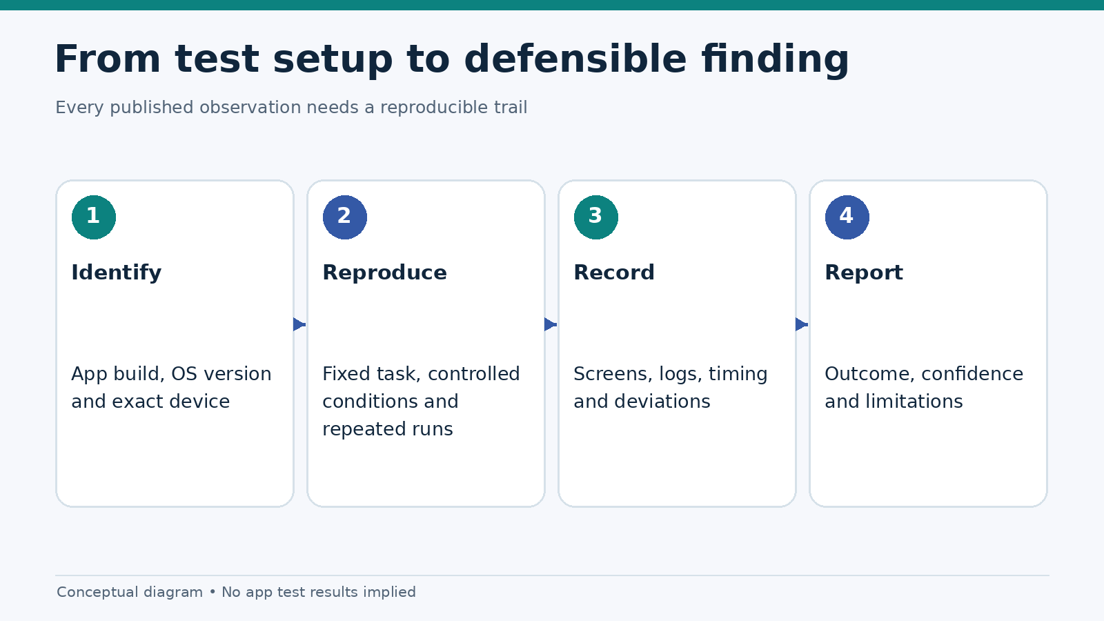
A five-tap navigation audit checks whether a user can find essential controls without searching through layers of menus. The tasks are deliberately ordinary: locate account settings, find safer-gambling tools, and reach help. A short route is useful, but tap count alone does not establish good usability. The user also needs clear labels, an obvious next step and a way back.
This is a repeatable mobile gambling app navigation test, not a ranking of casino brands. The five-tap limit is an editorial testing threshold, not a published accessibility standard or a legal requirement. No named app has been tested for this article; the paths below are examples of how to record observations. Our broader 25-point mobile app testing checklist covers other aspects of app quality.
What should be easy to find?
Users should not have to guess where account and safety controls live. For this audit, we choose tasks that reveal information architecture rather than visual polish.
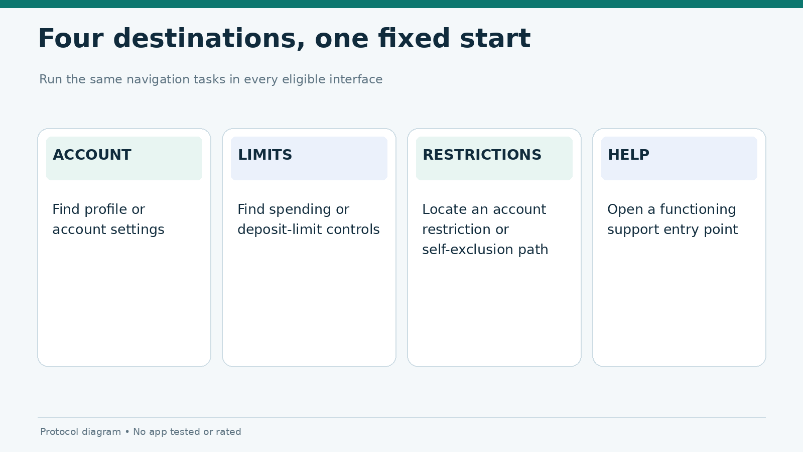
| Task | Start position | Success condition | What counts as a failure |
|---|---|---|---|
| Account settings | App home after sign-in | Open the screen for profile or account preferences | Settings cannot be identified or reached |
| Deposit or spend limit | App home after sign-in | Open the relevant responsible-gambling control | Only promotional or deposit options are surfaced |
| Self-exclusion or account restriction | App home after sign-in | Reach the relevant control or official support process | Critical option is hidden behind unrelated menus |
| Customer support | App home after sign-in | Find the working help entry point | Dead link, ambiguous label or looping path |
These tasks assess discoverability. They do not test whether a limit takes effect, whether account restrictions are processed correctly or whether a support agent responds. Those require separate functional checks.
How to count taps without distorting the result
Choose a fixed starting state: a signed-in home screen, with overlays closed and no keyboard visible. Define the target screen before beginning. A tap is a deliberate touch activating a control; scrolling is recorded separately because it can hide navigation depth without adding a menu tap. An operating-system permission prompt, modal, failed tap and return navigation should each be logged rather than silently ignored.
- Reset the application to the agreed starting screen.
- Read the visible labels as a first-time user would; do not use prior knowledge of the menu structure.
- Follow the clearest route to the target. Count each activated control.
- Record scrolling, search use, backtracking, dead ends and unexpected redirects.
- Stop when the target screen is visible or when the test is abandoned after a defined timeout.
- Repeat with a second tester or a second independent run to check whether the route was discoverable rather than memorized.
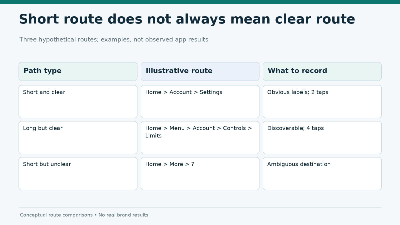
A route such as Home → Menu → Account → Preferences is three taps if each arrow represents one control activation. It is not a real observed app result. The route should be written down alongside the recording so another tester can reproduce it.
The five-tap threshold is best used as a diagnostic prompt: Why did this task take six or seven steps? A six-tap route with clear labeling may be easier than a three-tap route filled with indistinguishable icons. Record the count and the reason behind it.
A scorecard that preserves context
| Field | Example entry | Why it matters |
|---|---|---|
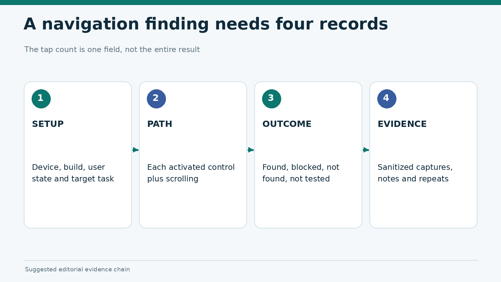
| Device and build | Exact phone, OS and app version | Layout and menu locations may change |
| Task | Find account restriction options | Defines the target |
| Tap path | Home → Menu → Help → Account controls | Makes the route reproducible |
| Tap count | 3 (illustrative only) | Measures depth, not quality |
| Scrolling / search | One scroll, no search | Distinguishes hidden content from menu steps |
| Label clarity | Clear / unclear, with reason | Records comprehension problems |
| Outcome | Found / not found / blocked | Prevents false pass rates |
For reporting, use found within five taps, found after more than five taps, not found, and not tested as separate outcomes. Never mark an untested route as a fail. If login, age verification or regional availability blocks the feature, record the block instead of assuming the option does not exist.
The warning signs behind an excessive tap count
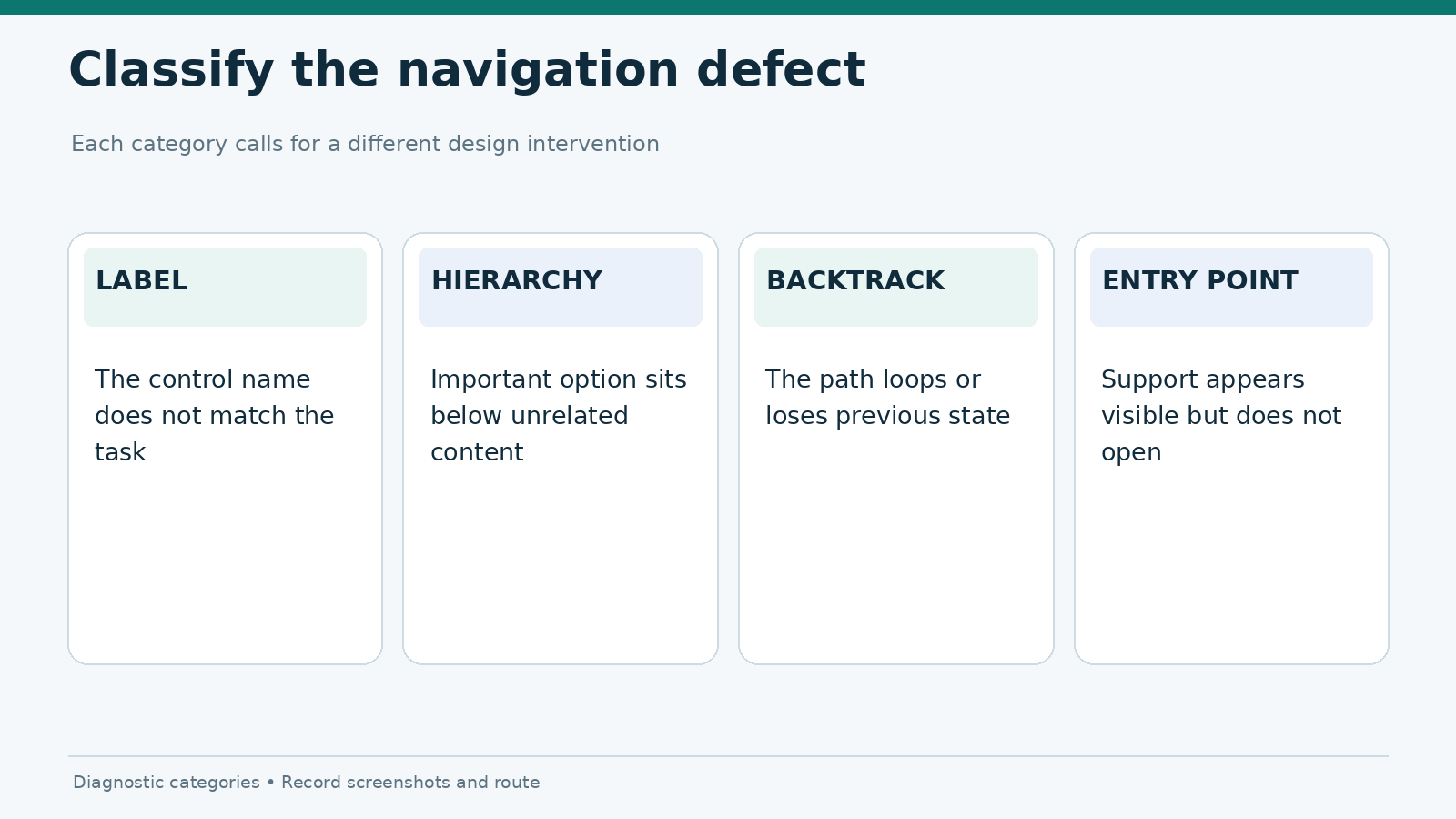
Labels that do not match the user’s goal
A person looking for a spend limit may search for “Limits,” “Safer Gambling,” “Responsible Gaming” or “Account Controls.” If the feature is filed under a generic “More” menu, the tester may repeatedly choose the wrong branch. Capture the visible labels and note whether a reasonable alternative term would have helped.
Critical controls placed below promotional modules
An app can technically expose an option while burying it beneath carousels, banners and unrelated links. Note whether the user must scroll past non-essential content and whether the position shifts when personalized modules load. This is an information hierarchy issue, not simply a tap-count issue.
Broken back navigation or repeated loops
A route may be quick in one direction and difficult to reverse. Test whether the Back action returns to the previous menu, restarts the home screen or unexpectedly dismisses a form. A tester who loses context and repeats several taps should log those steps. Do not omit backtracking from the observation record.
Help that looks available but cannot be reached
A visible chat icon is not equivalent to accessible support. Confirm whether tapping it opens a usable channel, a FAQ page, an external browser or an error. The five-tap audit ends at the working help entry point; response quality and waiting time belong to separate support testing.
Consistency and accessibility checks
Navigation should remain predictable across the product. The W3C’s WCAG guidance on consistent navigation explains why repeating navigation elements in a stable order helps users. Its consistent help criterion is particularly relevant when help mechanisms appear in more than one location. These criteria do not prescribe a five-tap maximum.
While counting taps, note whether controls have meaningful labels, whether menu order changes unexpectedly and whether a visible link has an adequate target. The detailed screen-reader audit belongs to MG-020 and the compact-screen clipping test belongs to MG-015. Keeping those questions separate prevents one page from becoming a catch-all UX checklist.
Run the audit across two app types
A fair comparison needs more than one interface pattern. Use one eligible native mobile app and one eligible web or PWA experience, if both can be lawfully accessed in the test market. Apply the same task wording, account state and success definition. Do not use location spoofing or unverified installation files to gain access to a restricted product.
Test each task at least twice and keep the first-discovery result separate from the repeat result. A known path almost always feels easier than an unfamiliar one, so a repeat run must not replace the original observation. Store sanitized screenshots, device/build information, notes and the task script together.
Use the following report structure after actual testing:
| Task | Native app | Web/PWA | Interpretation |
|---|---|---|---|
| Account settings | Not tested | Not tested | No comparison available |
| Limits | Not tested | Not tested | No comparison available |
| Account restrictions | Not tested | Not tested | No comparison available |
| Support | Not tested | Not tested | No comparison available |
These cells are intentionally not populated with invented results. When evidence is available, replace them with observed paths and link the screenshots or recordings. A summary score without those records would conceal how the tester arrived at the conclusion.
What the five-tap audit can—and cannot—tell you
A good result means users can discover and open important destinations with relatively little navigation effort under the tested conditions. It does not mean an app is secure, licensed in every country, financially suitable or accessible to every user. Interface changes, signed-out sessions, age checks and device settings can all alter the path.
For a practical editorial rule, publish the route, the count, the starting state and the confusing moments together. If a safer-gambling tool cannot be found, describe the observed navigation failure without inferring that the operator lacks the tool entirely. Gambling services are subject to location- and age-specific rules; readers should check local requirements and the provider’s verified documentation.
Frequently asked questions
Is five taps an official usability standard?
No. It is a simple editorial threshold for comparing navigation depth. Clear labels and successful task completion matter as much as the number of taps.
Do scrolling and typing count as taps?
Report them separately. A hidden control can still be hard to find even when the nominal tap count is low.
Should a support chatbot count as customer support?
Count it only as a support entry point if it opens successfully. Whether it solves the user’s problem is a different test.
Can a logged-out user take the same audit?
Yes, but the task definition and starting state must change. Never compare a signed-in route with a signed-out route as if they were equivalent.
Editorial evidence status: Protocol only. No casino operator, native app or PWA was tested for this article. The diagrams illustrate test design and do not represent measurements.